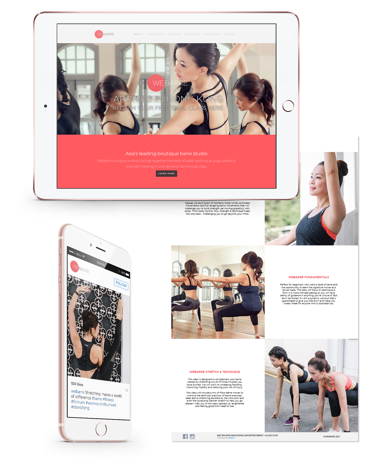
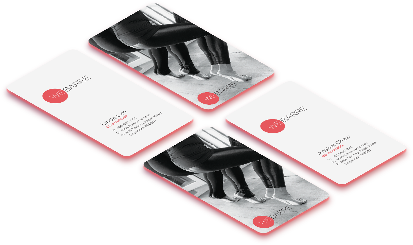
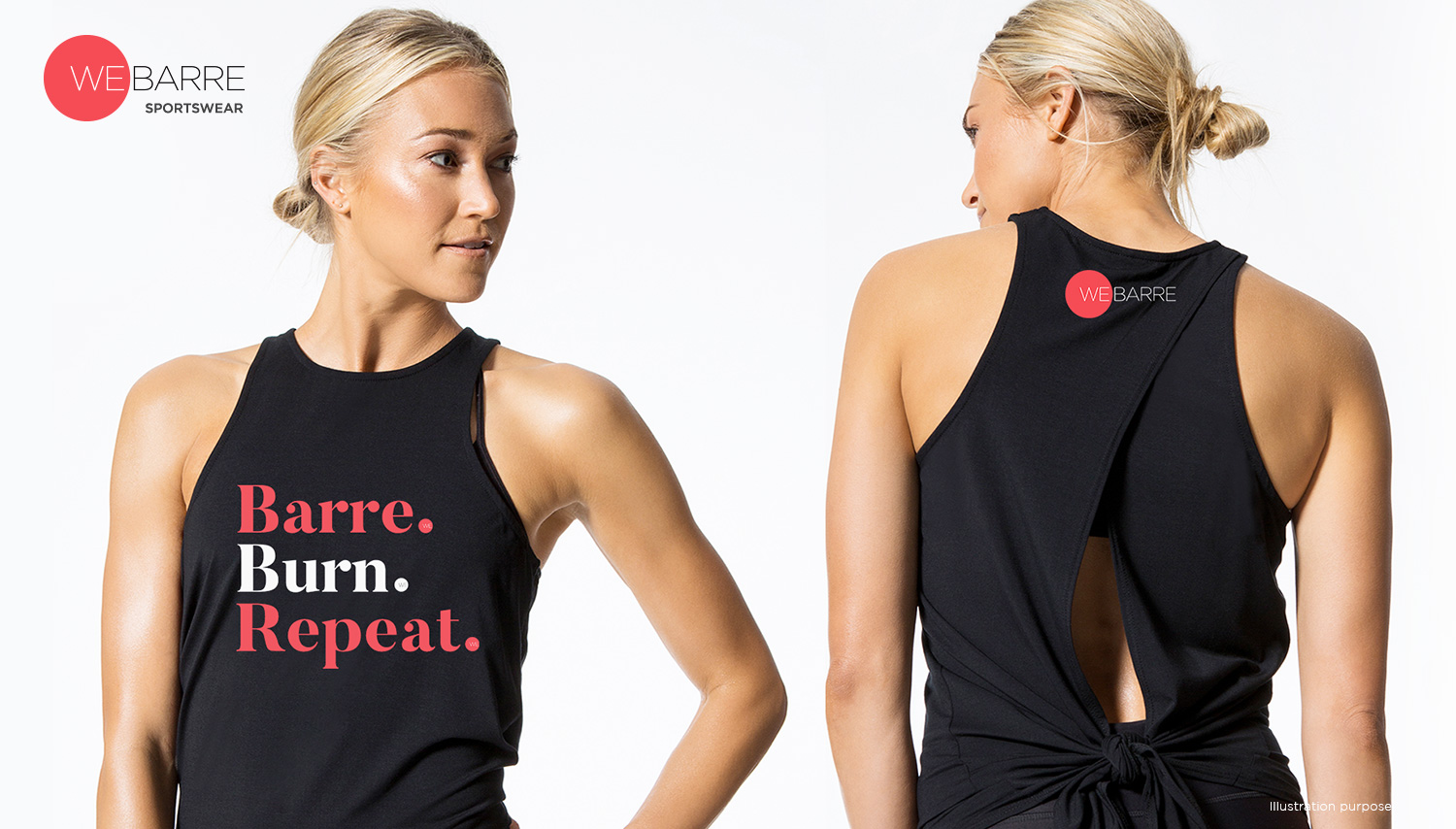
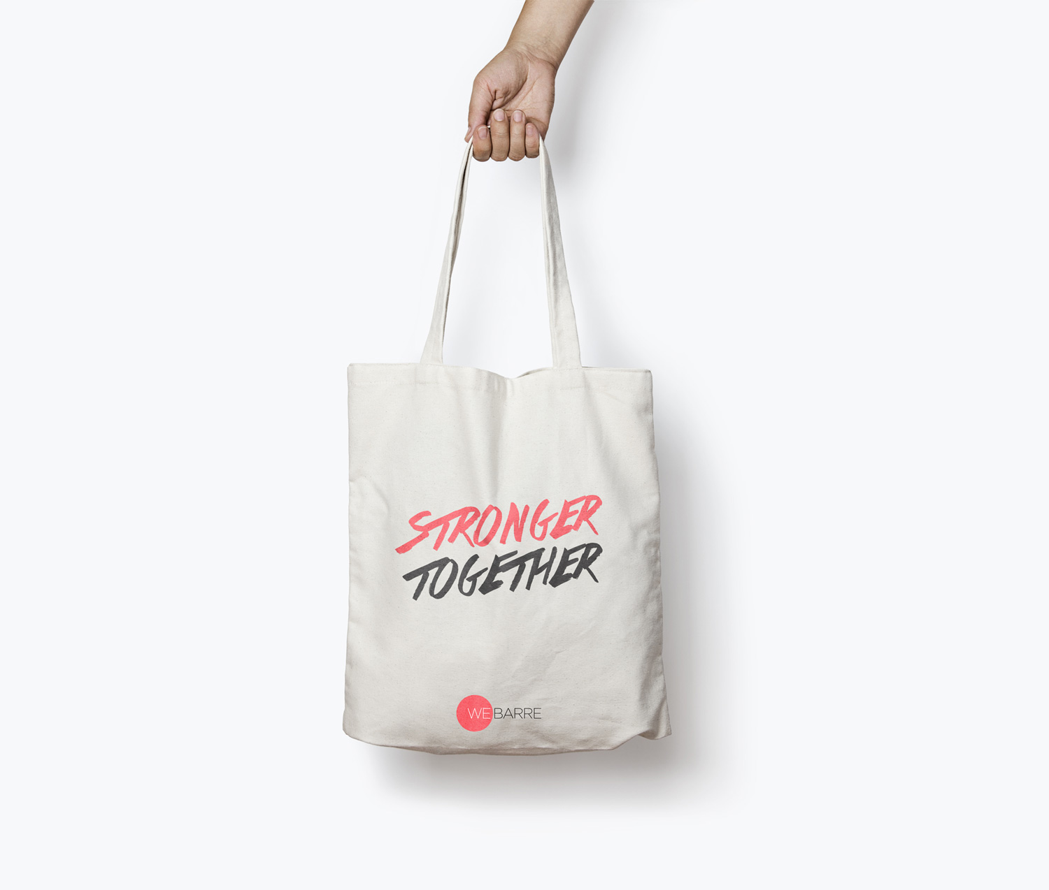
Continually raising the barre in the local fitness scene, WeBarre is now recognised as one of Asia’s leading boutique fitness studios. Thus, it is important to us to create a branding that can represent the WeBarre community and barre enthusiast gracefully. A circular shape serves as a core part of the branding – encapsulating and celebrating the brand’s inclusivity.
The brand harmonises and combines two seemingly opposing qualities – strength and grace. We captured that in a simple, timeless, yet incredibly versatile and elegant branding system.


