WeBarre
- Branding Identity • Branding
- Singapore • Hong Kong
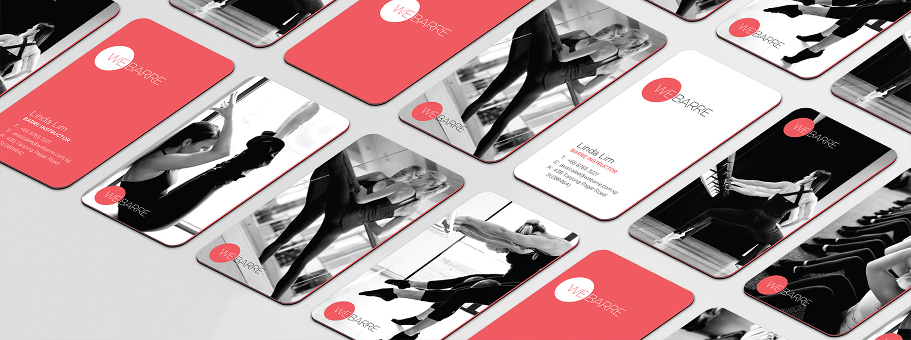
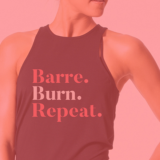
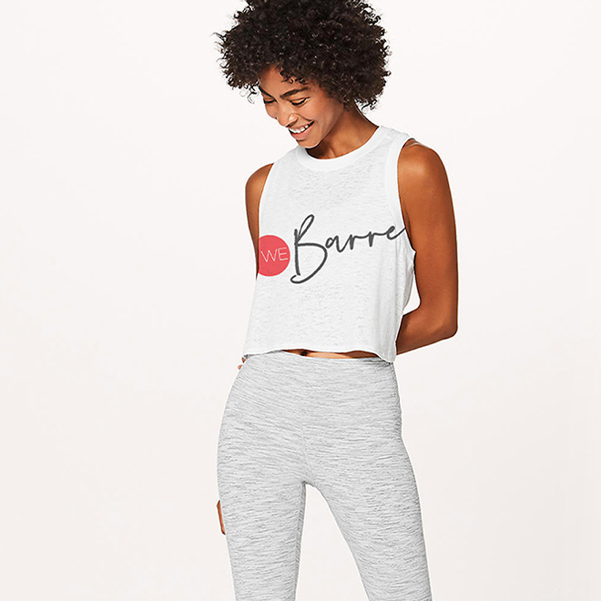
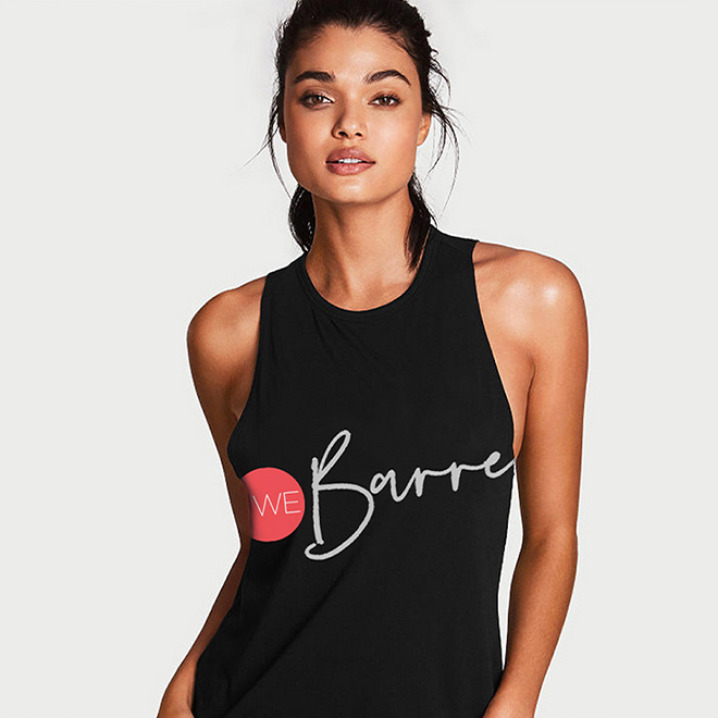
We raised the barre in the local boutique fitness scene by providing a versatile and inclusive branding for WeBarre
Continually raising the barre in the local fitness scene, WeBarre is now recognised as one of Asia’s leading boutique fitness studios. Thus, it is important to us to create a branding that can represent the WeBarre community and barre enthusiast gracefully.
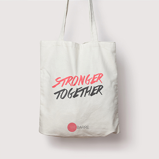
Harmonises and combines two seemingly opposing qualities – strength & grace
Inspiration for WeBarre’s brand identiy is derived from the characteristics of the typeface – a reflection of simplicity, minimalism and elegance.
A circular shape serves as a core part of the branding – encapsulating and celebrating the brand’s inclusivity.